This project follows the variations and ideations in designing a logo for
"The Good Grind Company"
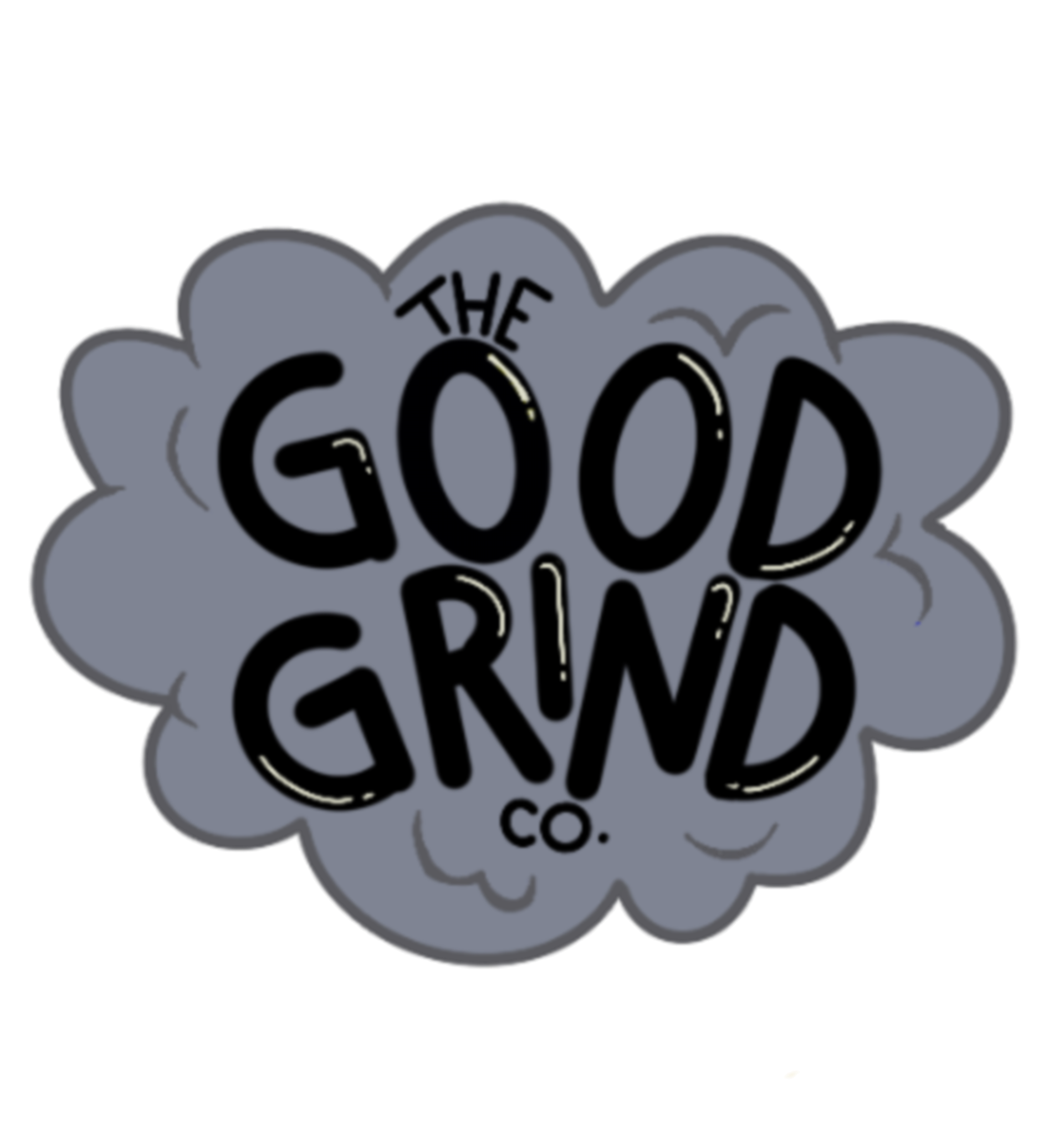
The company is a retailer for smoking tools and equipment. The client approached with a rough sketch of the idea with the intended denotations of the logo to show smoke clouds yet also be friendly and light hearted in nature.

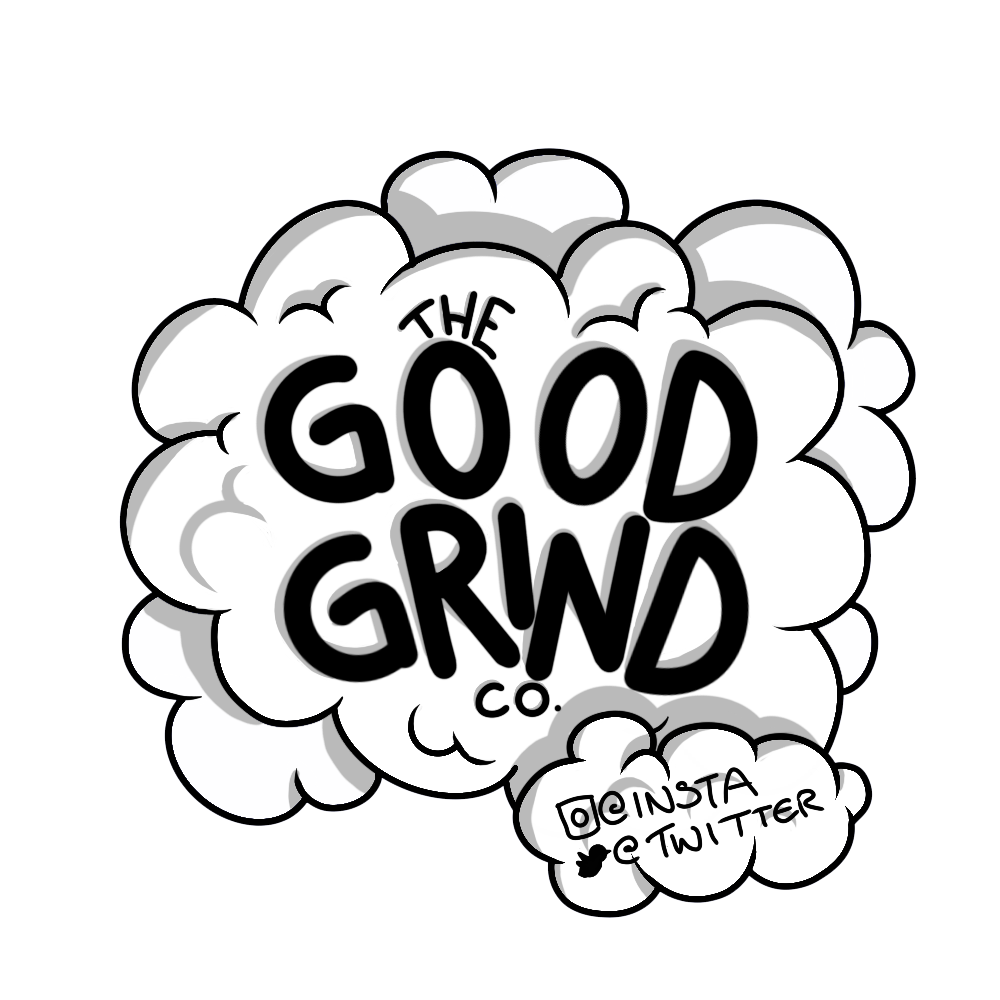
Design development shows the growth and inclusion of more smoke clouds to make the logo more circular and add depth.
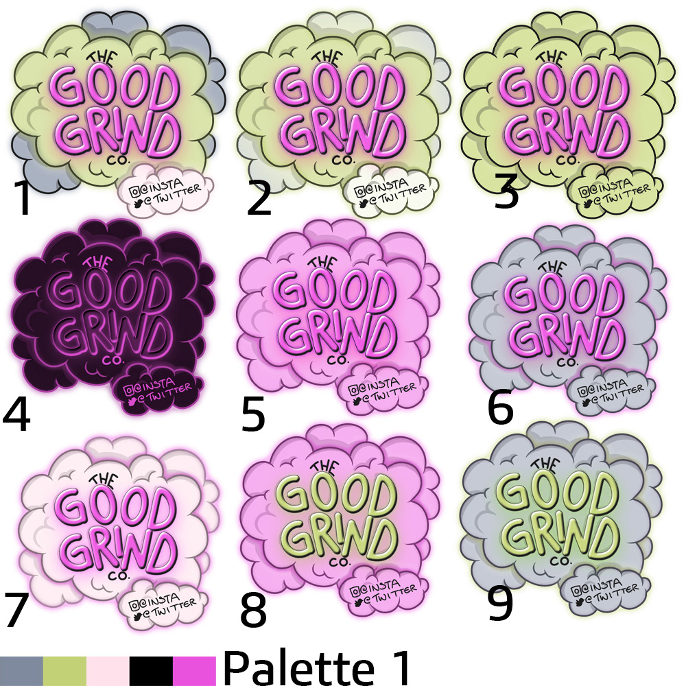
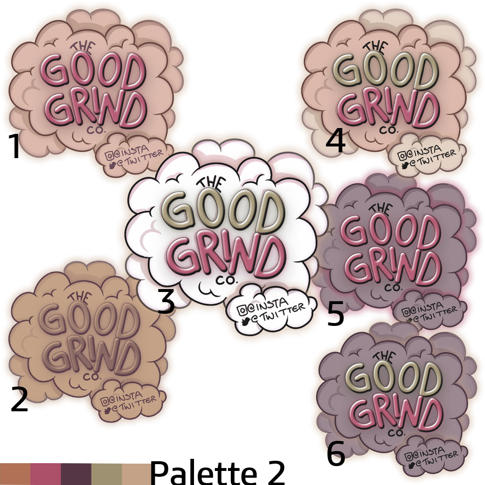
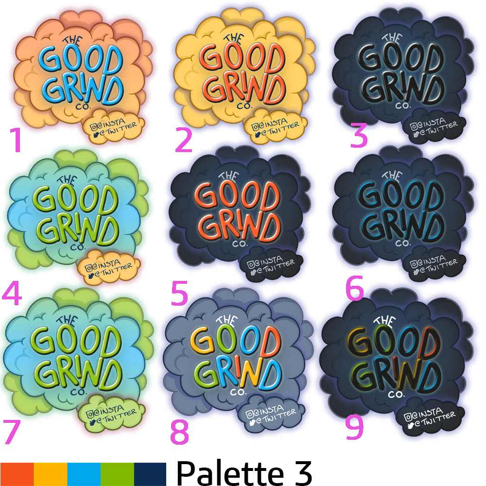
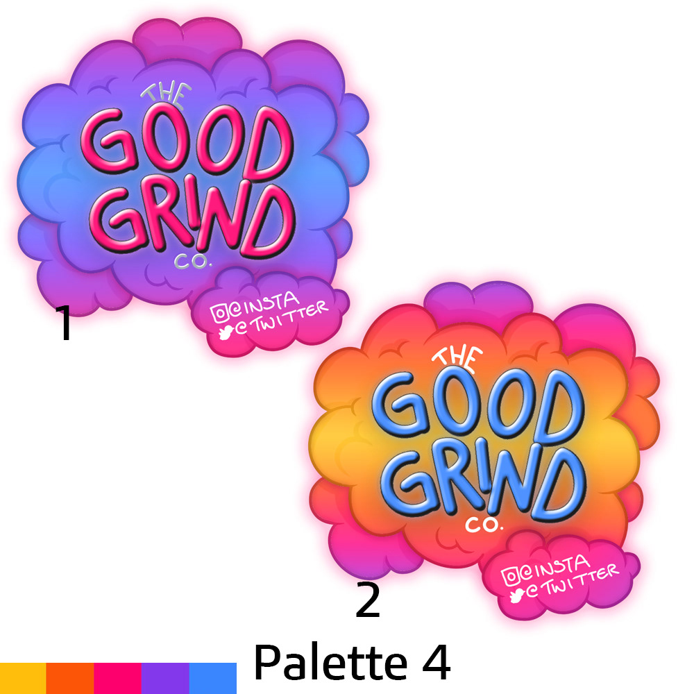
The next step included providing the client with a wide variety of colour palette variations so they could discover which palette combination best suited them and the style which the wanted to promote for their brand.
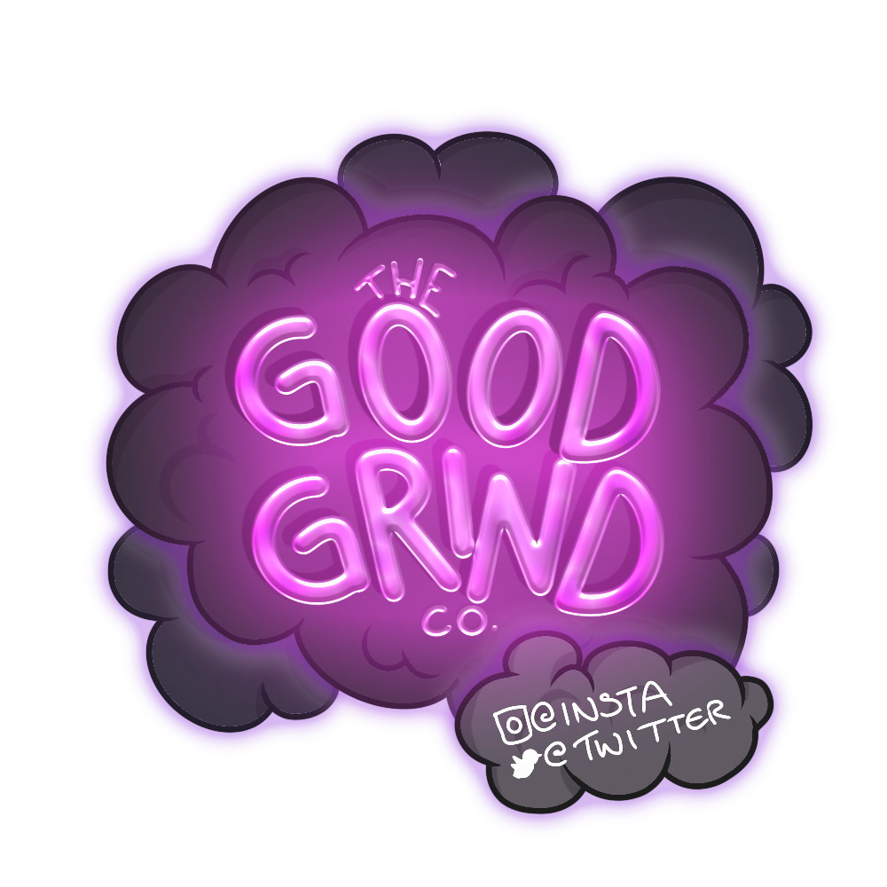
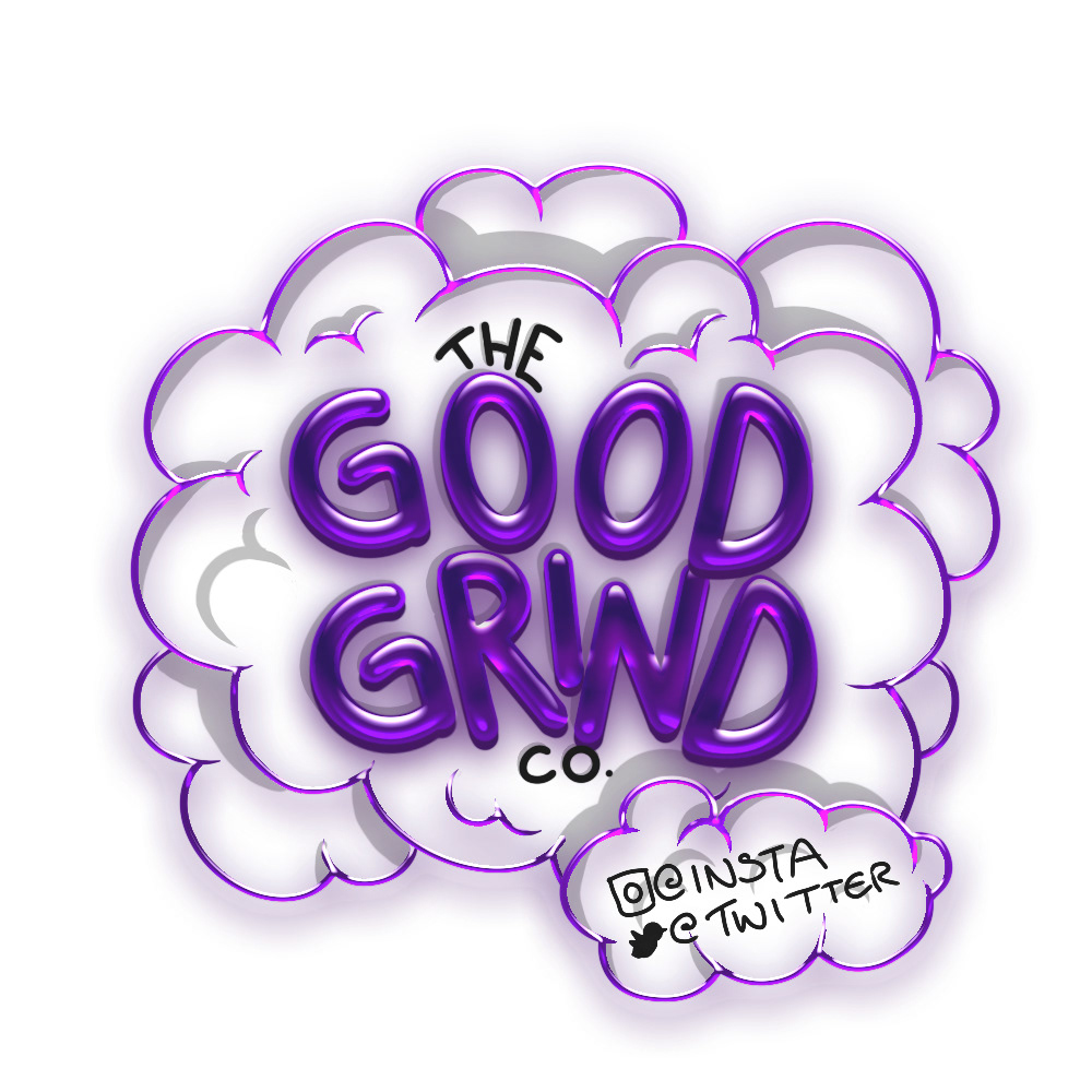
Once a preferred palette was selected, the design was then further developed to with different visual effects. Though this much effect would prove tedious to print, the client like the idea of their social media advertising to include some level of animation and graphic effect.
However, after further discussion it was agreed that brighter colours may lead the product to be attractive to a underage audience which was not the clients intention.
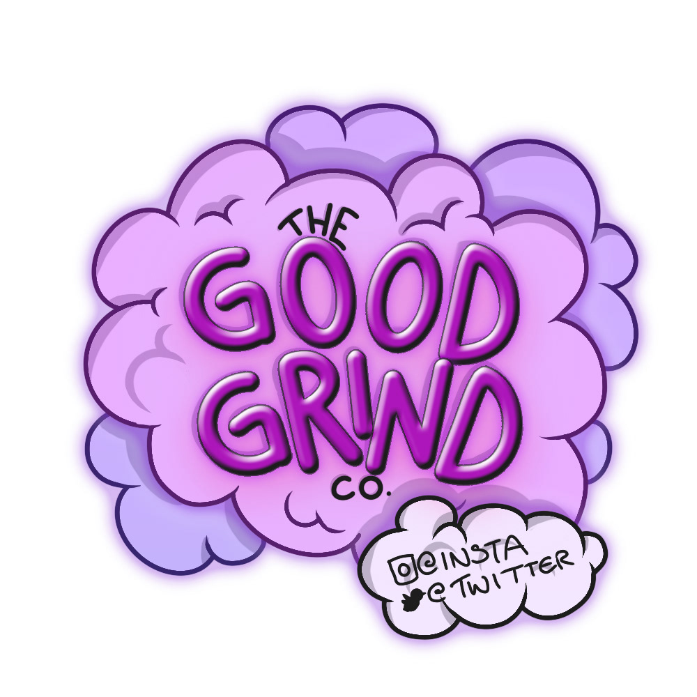
Thus the design was reverted to a softer palette that still stood out with its use of contrast, but used subtler colours tailored to a more adult audience. The logo was then animated which could then be used for social media advertising.
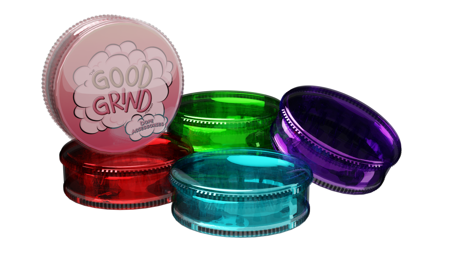
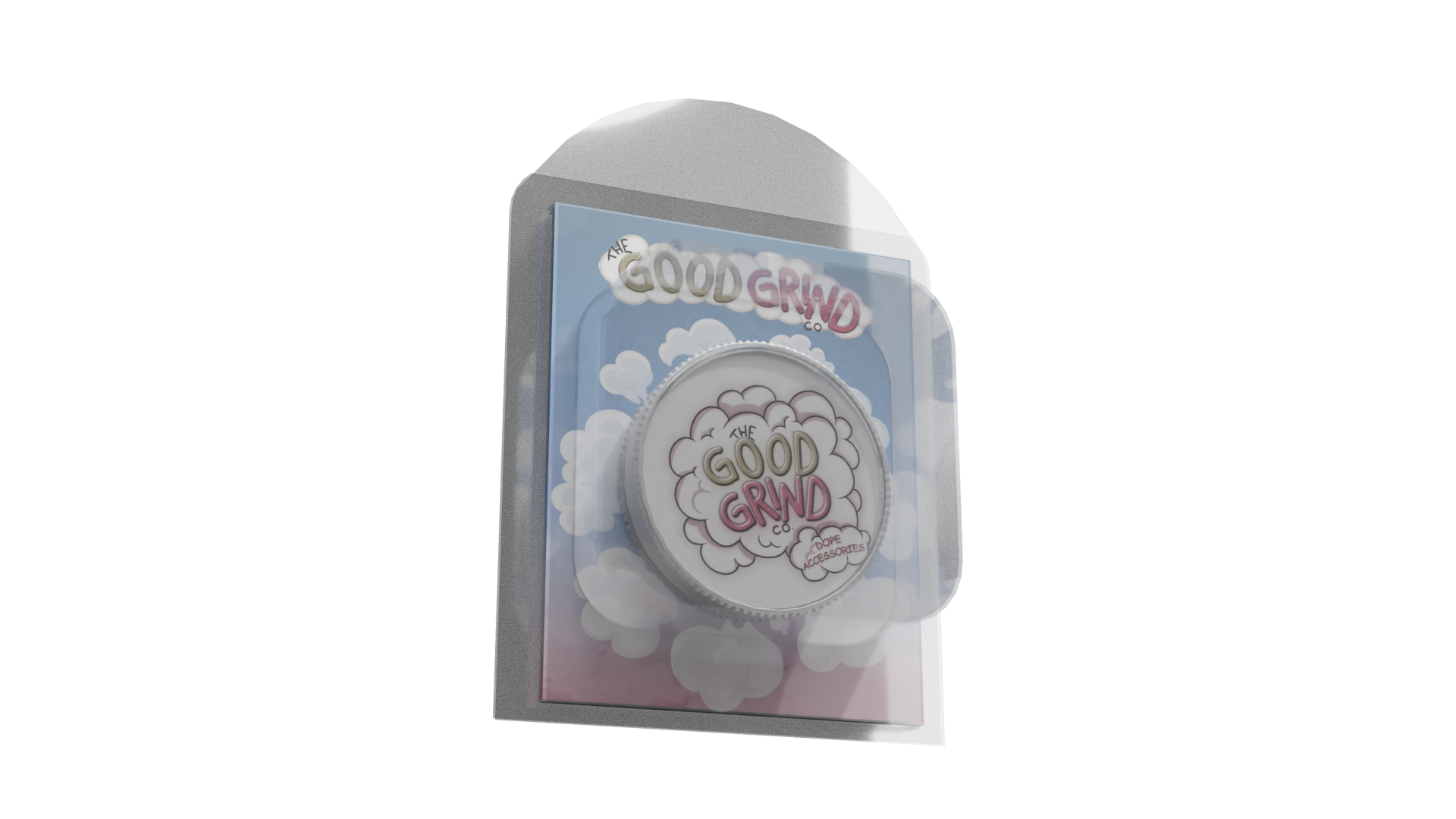
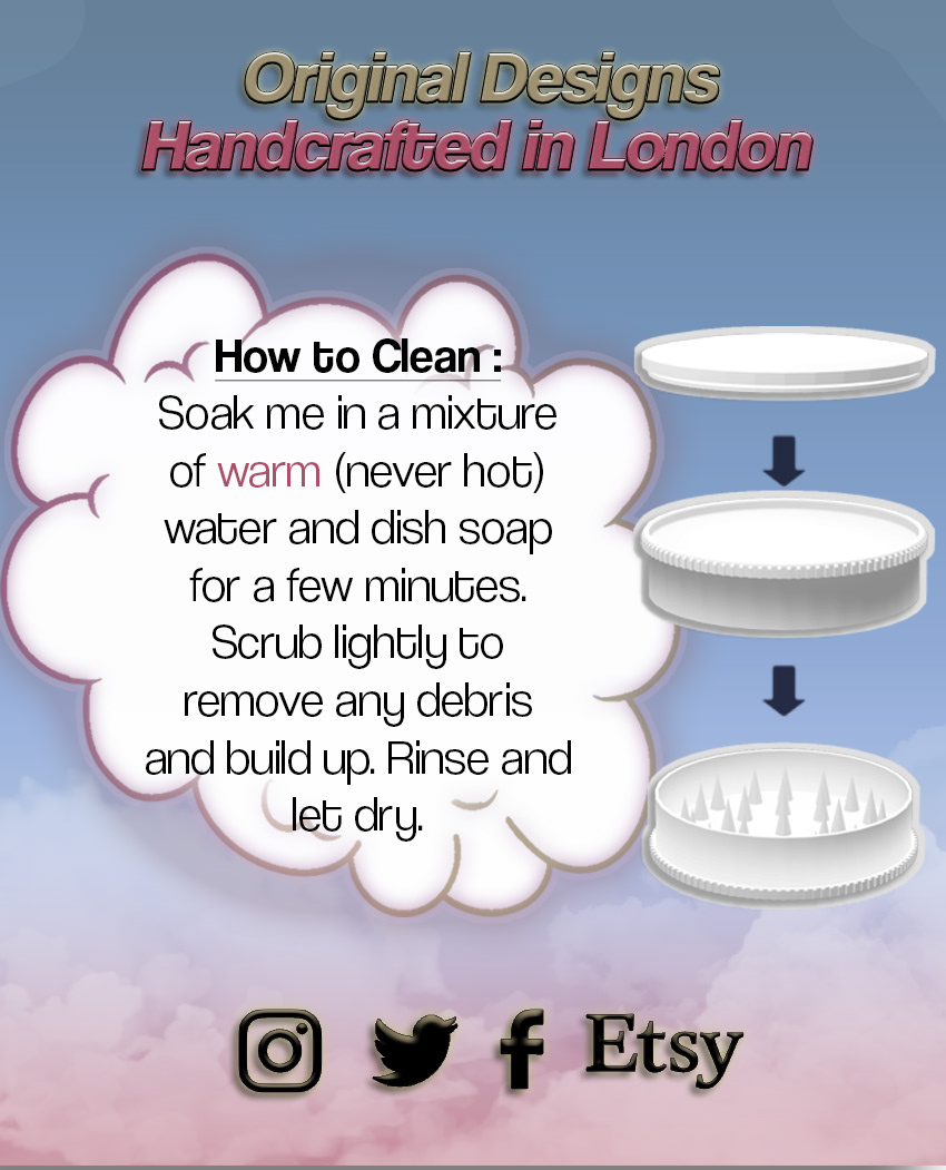
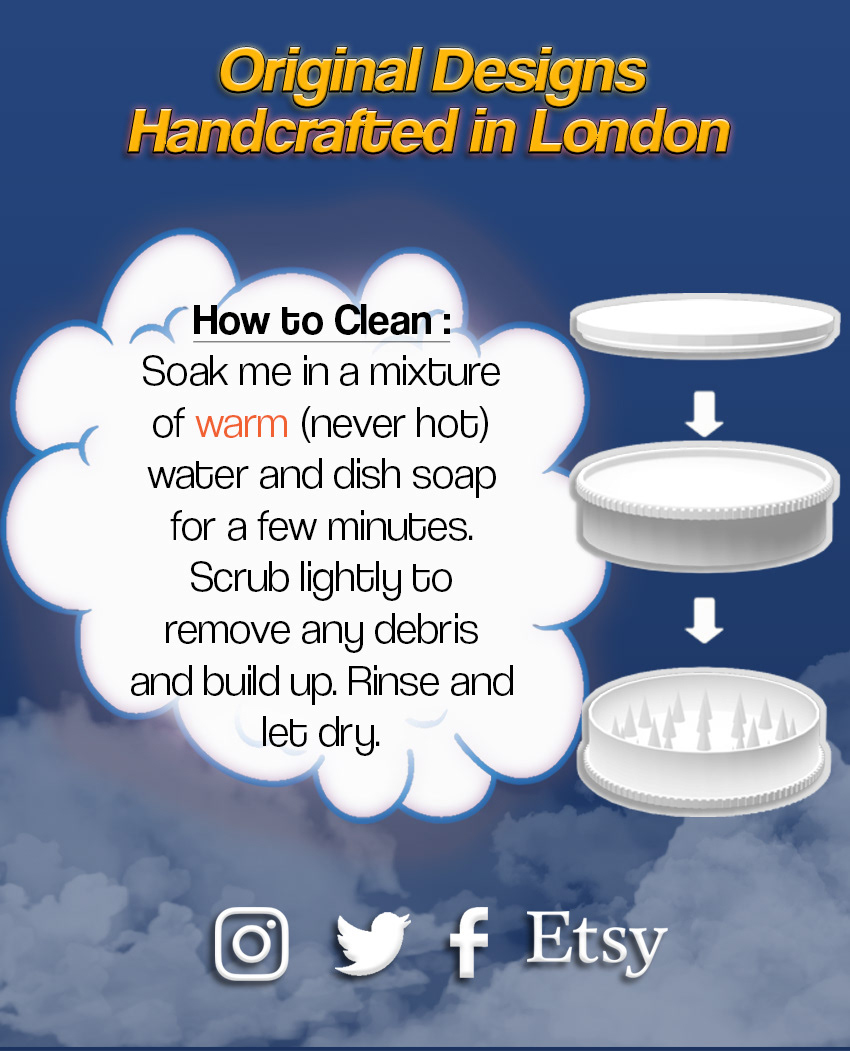
Next up was implementing the design onto some packaging mock-ups. This stage was complete by modelling the design in blender (files attached), then adding the logo and complimentary packaging. This helped the client visualise how their final product would look.
Though the project had been completed, exceeding the clients expectations, they decided that they wished to see an alternative design - something more minimal and mature - and so this new design was created.
